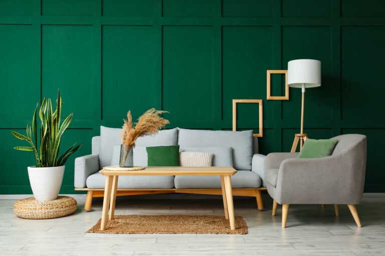
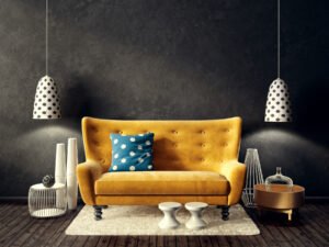
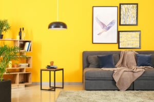
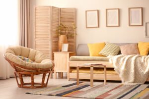
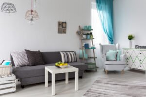
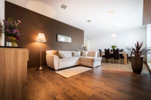
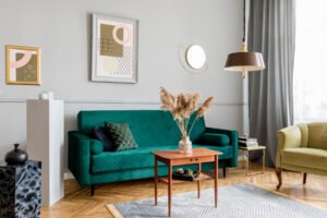
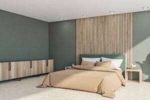
Green is a charismatic color that adorns the space with its vibrant and calming vibes, making it an excellent addition to your interior design. Different shades of green can magically transition from soft, supple interiors to elegant, classy decor instantly!
However, choosing a color palette for vibrant accent colors is always confusing, and green is no exception. To make things easy for you, I explored my favorite home interior color palettes and extracted 21 most beautiful colors that can never go wrong with green in any decor!
Chic Colors That Go With Green
1. White & Green
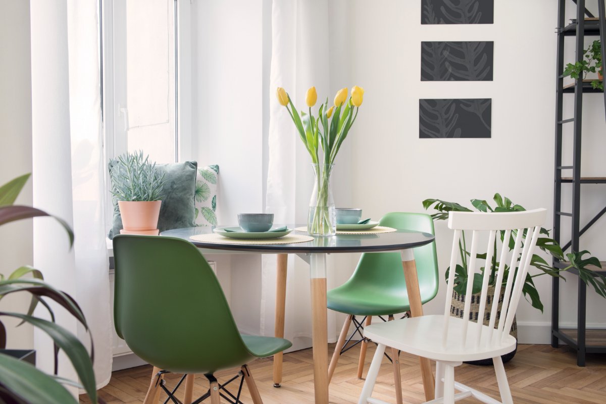
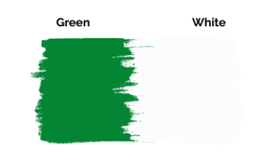
A combination of white and green is your best bet for a trendy, Boho-chic look. Where white offers a balanced, neutral backdrop, green accents the look, adding the extra pomp that makes spaces look spacious and minimal.
Moreover, since white is a versatile color, you can pair it with lighter shades of green for a bright, industrial look or match it with dark green or hunter green for a lavish, new-classical appearance.
You can complement your dark green couch with subtle gold accents and checkered light gray rugs for a lovely, new-classical appeal with white walls.
Here are the best shades of Neutral White to match a Green color scheme:
- ‘Pure White’ and ‘Alabaster’ by Sherwin Williams
- ‘Du Jour’ and ‘Bistro White’ by Valspar
- ‘Ultra Pure White’ by Behr
2. Gray & Leaf Green


If you need a modern, casual, but sophisticated ambiance, use gray with green. Being coordinating tertiary colors, these colors pair well together. While gray adds a smoky, streamlined look to the bright green, green, in return, adds more vibrancy.
Thus, grays work exceptionally well with bright and light leaf green. You can use gray as the primary color for your walls and floors and add subtly pops of any light green shade for a genuinely inspiring industrial decor. When paired with other neutral colors like white and beige, the combination will help you curate a trendy Boho look.
Moreover, the bright green and dark gray color palette can also give your home a superior transitional look when paired with golden or silver accents. Hence, you can use it to display class and luxury in get-together areas like family rooms and halls.
A list of the best shades of gray for a modern appeal with green:
- ‘PepperCorn’ and ‘Grizzle Gray’ by Sherwin Williams
- ‘Slate Gray’ and ‘Casual Gray’ by Behr
- ‘Parma Gray’ by Farrow and Ball
3. Soft Beige & Green


Beige simply connotes a neutral, breezy aesthetic but creates a high-end punch with green. Calm, refreshing, yet funky, this color palette results in a crisp, contrasting, and nature-inspired look that enlivens semi-enclosed spaces, patios, decks, and verandahs.
Beige creates a friendly, mid-century modern interior with green, but you can add lighter shades, such as light wood tones, oranges, and dusty pinks, for a colorful Asian feel. Furthermore, beige will also go with rustic shades of green, like olive, sage, and emerald green, for an organic farmhouse look.
You can pick pinkish or yellowish shades of beige for a livelier combination with green and smear some stainless steel accents for a minimal, industrial ambiance.
A list of the best shades of Beige that go with Green:
- ‘Bleeker Beige’ and ‘Bayshore Beige’ by Benjamin Moore
- ‘Savoury Beige’ by Valspar
4. Taupe & Green
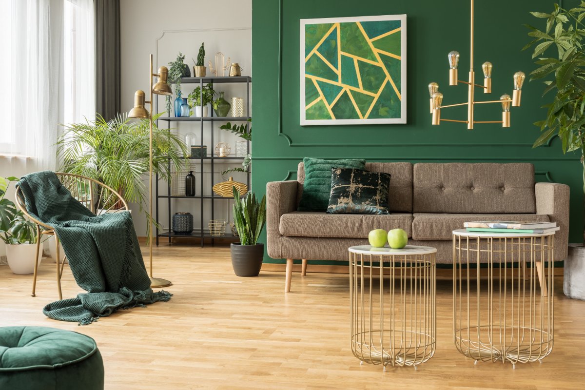
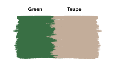
Taupe is a serene, earthy color with a slight gray undertone that looks elegant with the natural green shade. This pairing can be used to bring in a nature-inspired cottage or modern farmhouse look in makes common activity areas like dining, reading rooms, and halls.
With a soft accent to green, taupe is a beautiful foundation color that allows the green to take center stage. It can also be used as an accent to tone down bright green walls.
Here are the best shades of Taupe from the color wheel:
- ‘Taupe Fedora’ and ‘Tyler Taupe’ by Benjamin Moore
- ‘Parlour Taupe’ by Valspar
5. Black & Cool Green
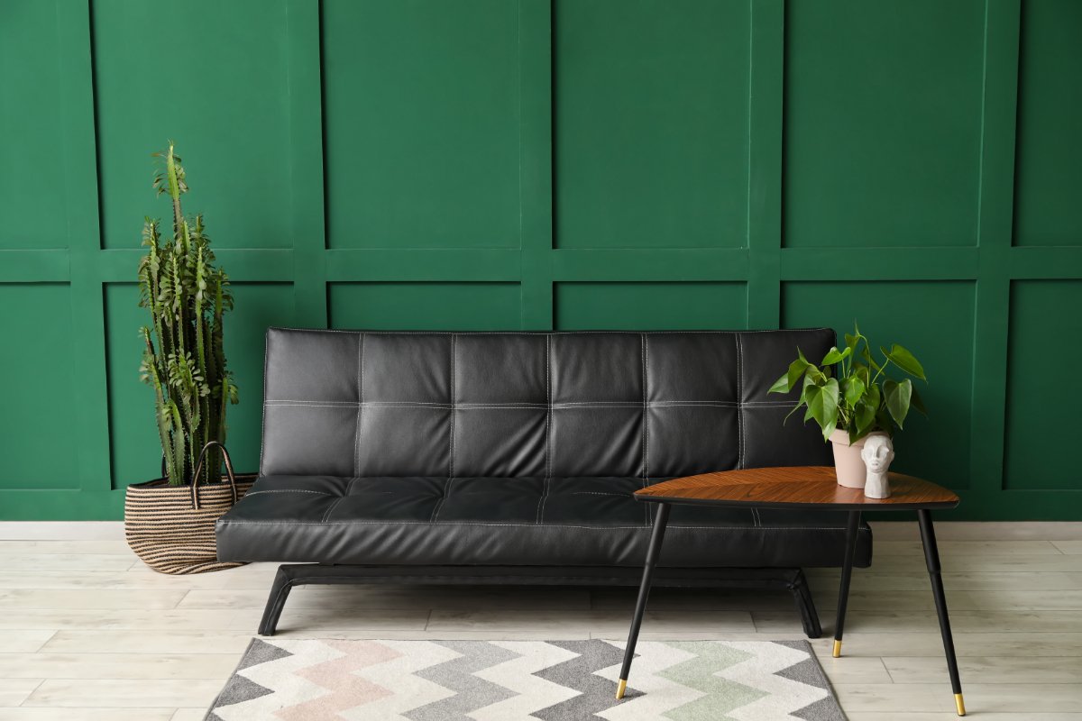

Green and black are a perfect pair to add personality to an enclosed space. The key here is to match the right shade of black and green for a crisp contrast. A darker, cool green looks rich and formal with black, while the lighter greens look playful and casual.
It is a dramatic, high-contrast combination that appears balanced. Another perk is that since black is a dark neutral color, it will make the space look artistic and maximal, working wonders for bedrooms, bathrooms, reading rooms, and even large office spaces.
You can complement your neutral, jet-black couch with bright green walls for a layered mid-century modern look and add light gray flooring or rugs to enhance the contrast. Or, if you have warm black paneling, you could use dark green or hunter green accents for a luxurious Victorian look for living and dining rooms.
Black is a comparatively dark color and, if used in abundance, can seem jarring to the eyes. Hence, always ensure adequate lighting to tone down the heaviness of black.
Check out the best shades of black to add more contrast to green:
- Jet Black’ and ‘Black Tar’ by Benjamin Moore
- ‘Pitch Black,’ ‘Paean Black,’ and ‘Bible Black’ by Farrow and Ball
6. Cocoa Brown & Green

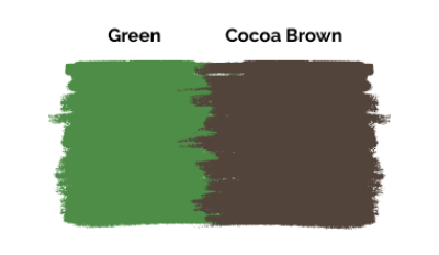
Cocoa Brown is a deep earthy shade that contrasts the cool undertones of green and designs a lovely Georgian or cottage-style look. The color adds a calming element to the playful green and exudes a cozy look.
For instance, you can pair a light cocoa brown with a lighter shade of green like mint or sage for a casual, easy-going vibe for living rooms and halls, or match it with darker cocoa brown for a regal transitional look in your private spaces.
However, a brighter green and cocoa brown color palette might look dark and heavy in compact spaces like kitchens and lobbies. In such a case, you can use a lighter chocolate brown or caramel brown for a brighter, balanced look.
The best shades of cocoa brown to match with green:
- ‘Cocoa Brown’ by Benjamin Moore
- ‘Hot Cocoa’ and ‘Dutch Cocoa’ by Sherwin Williams
7. Yellow & Green
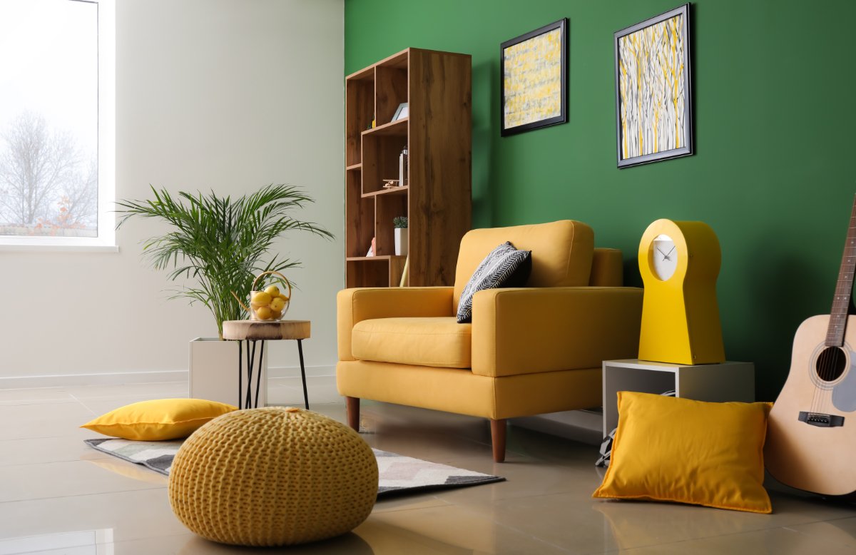

Yellow and green are unmistakable choices if you dream of a 90s pop-culture vibe in your spaces. Here, a pastel yellow looks easy-going and modern, while light green and mustard curate a lavish design!
Here, you can use green as the foundation color and accentuate it with bright yellow or mustard accents for a striking look. Or you can add green rugs, carpets, and even furniture for a soft mid-century modern design with bright yellow walls.
In a nutshell, yellow looks modern, crisp, and chic with light green, mint green, and pale green but curates a regal transitional interior with darker shades of green.
Here are the best shades of yellow to go with green:
- ‘Lemon Twist’ and ‘Cheerful’ from Sherwin Williams
- ‘Yellow Highlighter’ by Benjamin Moore
8. Hot Pink & Green
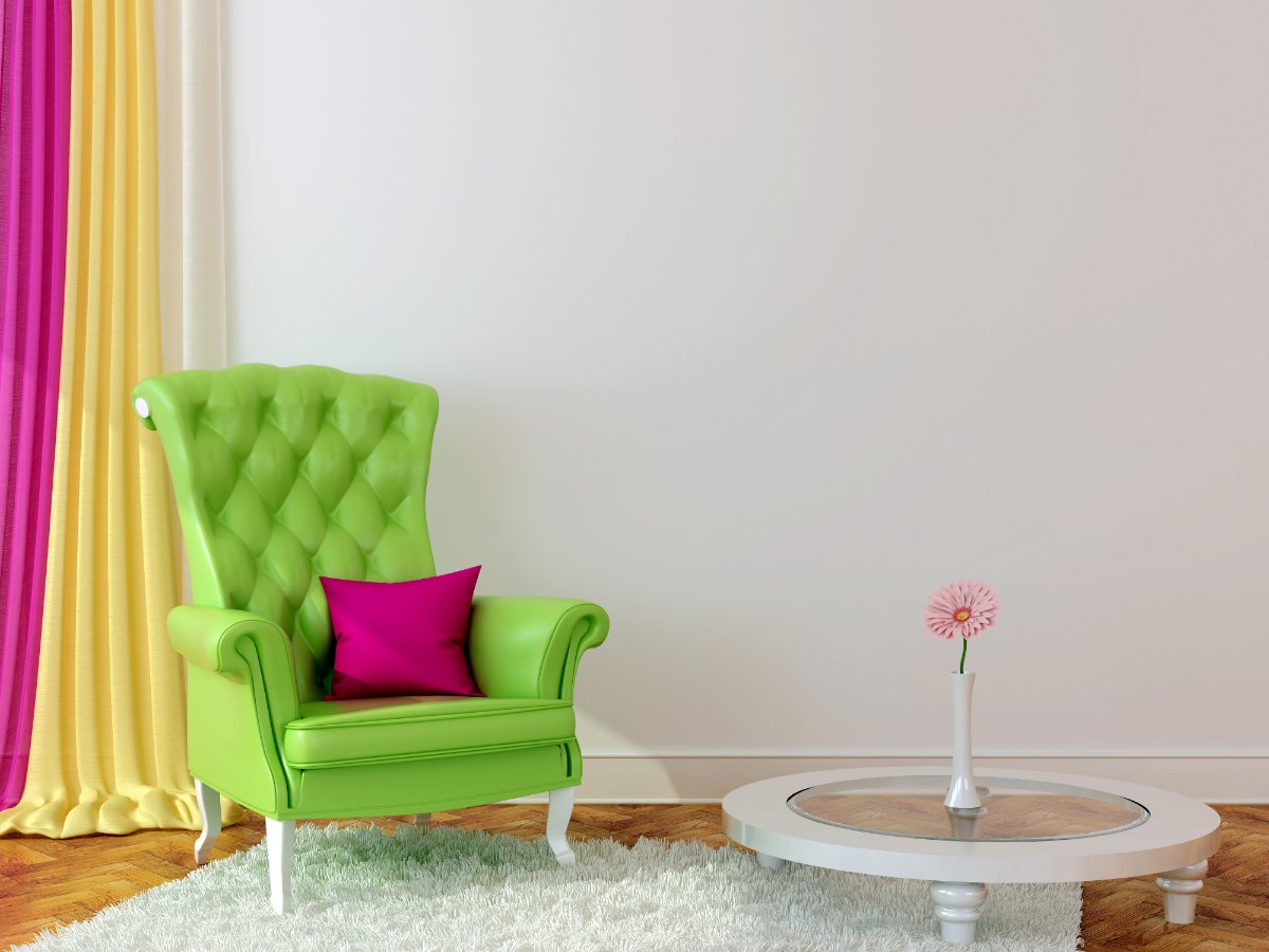
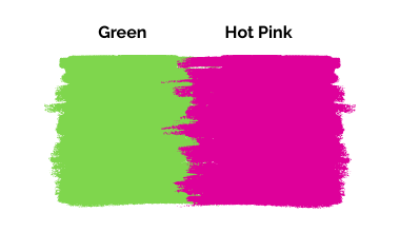
If you are looking for an electric color scheme for your modern home, pair green with hot pink. This is a high-end, playful pair that will enliven your space with vibrance and highlight your accent decorative elements!
This pairing works with light and dark, neutral settings. Moreover, it suits modern and traditional interior designs when paired with the right elements. You can also use hot pink with rich hunter green or emerald green for glamorous Jewel-style home designs.
Overall, hot pink looks bright and vivid and brings a pop-culture-like look to any space. Pair this duo with neutral color walls and floors, and you’ll have a balanced, global look that curates a unique interior for your green home.
Best shades of hot pink to go with green:
- ‘Eros Pink’ and ‘Feverish Pink’ from Sherwin Williams
- ‘Hot Lips,’ ‘Pink Tulips,’ ‘Hot Tamale’ from Benjamin Moore
9. Royal Blue & Green
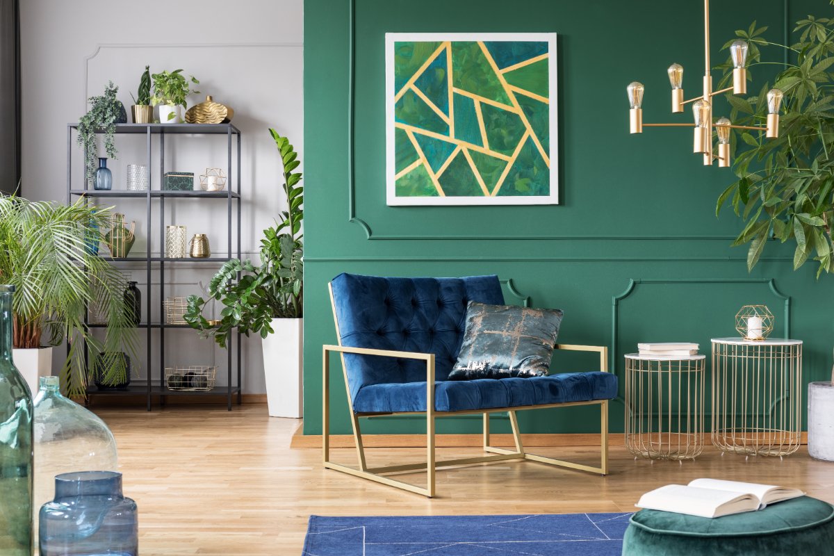

A low-contrast, monotone color scheme of green and blue adds a serene, soothing ambiance to spaces like verandahs, patios, and even southern-facing rooms with a lot of natural light. Since these are cool colors, they add exotic, refreshing nautical vibes!
Blue and green are analogous colors, which means that they coordinate well. While green adds a natural vibe to blue, blue tones down the casualness of green and makes it look sophisticated. Thus, the color combination is a balanced treat to the eyes in a high-end new classical design.
If you have blue accent walls, add a light green couch for a sharp contrast and modern appeal. If you have green walls, add blue furniture and rugs and accent them with white throw pillows for a seamless look. You can check more throw pillow ideas for a blue couch here.
Best Royal Blue shades with Yellow:
- ‘Loyal Blue’ by Sherwin Williams
- ‘Peek-A-Boo Blue’ and ‘Cravin’ Cobalt’ by Valspar
10. Light Blue & Dark Seafoam Green


Seafoam green and light blue are the colors of the ocean. Hence, this color palette calms down spaces and offers a crisp, nautical-style interior with a peppy visual appeal of the sea. Here, a light blue can work both ways as a primary color or accent!
You can curate a beachy, coastal look by adding dramatic pops of light blue furniture, rugs, or pillows against dark seafoam green walls and some warm and light colors like beige, brown, etc.
On the other hand, light blue walls add a soft, muted attire with seafoam green accessories, making it the best bet for semi-enclosed decks, patios, verandahs, and even office spaces with a new classical design. Shiny golden accents are also advisable to complete the look further.
Seafoam green and light blue are both accent colors. Hence, always add a tint of white, beige, or wood tones to avoid an overpowering look.
Stylish shades of Light Blue to go with Dark Seafoam Green:
- ‘Schoolboy Blue’ and ‘Crystalline’ by Valspar
- ‘Alluring Blue’ by Behr Paints
11. Copper & Dark Green

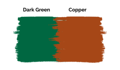
Copper is a high-end metallic paint that adds a luxurious accent and feel to dark green walls. A dark copper color will balance the cool accents of dark green, making it perfect for French country homes and regal glamour decor.
Further, copper and dark green are royal accent colors, but you can freely use either color as the main primary color for a striking interior. However, this combination might feel overwhelming in compact spaces like bathrooms and lobbies, but it will undoubtedly help you anchor larger areas like living rooms, bedrooms, and halls.
Top copper shades to go with dark green:
- ‘Copper Harbor’ and ‘Copper Wire’ by Sherwin Williams
- ‘Copper Canyon’ and ‘Copper Hide’ by Valspar
- ‘Copper Mountain’ by Behr
12. Orange & Emerald Green
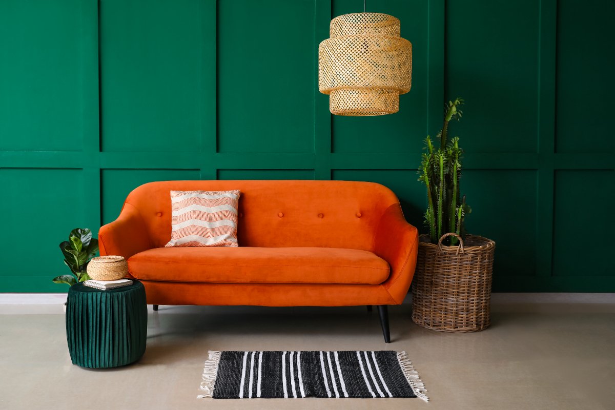

Burnt Orange is a rustic yet playful color that matches the vibrancy of emerald green and oozes an intense, warm vibe. This pairing will make private spaces like bedrooms and reading rooms more comfortable.
Orange instantly adds a pop of color against serene emerald green walls and thus is the best bet for a high-end Art Moderne interior design.
Alternatively, if you have an olive or army green color in your space, match toned-down shades of brick or burnt oranges for a soft, farmhouse interior. You can even add neutral tones like beige, cream, or light wood tones like maple or oak for a warm, southern living-like ambiance with orange and emerald green.
Since orange and emerald green are complementary colors, they create a dramatic look and achieve a striking contrast. Hence, limit your accessories to let the colors stand out.
Most popular shades of Orange to go with Emerald green:
- ‘Orange Burst’ and ‘Blaze Orange’ by Behr
- ‘Tangerine’ and ‘Marquis Orange’ by Sherwin Williams
- ‘Orange Fruit’ by Valspar
13. Tan & Green
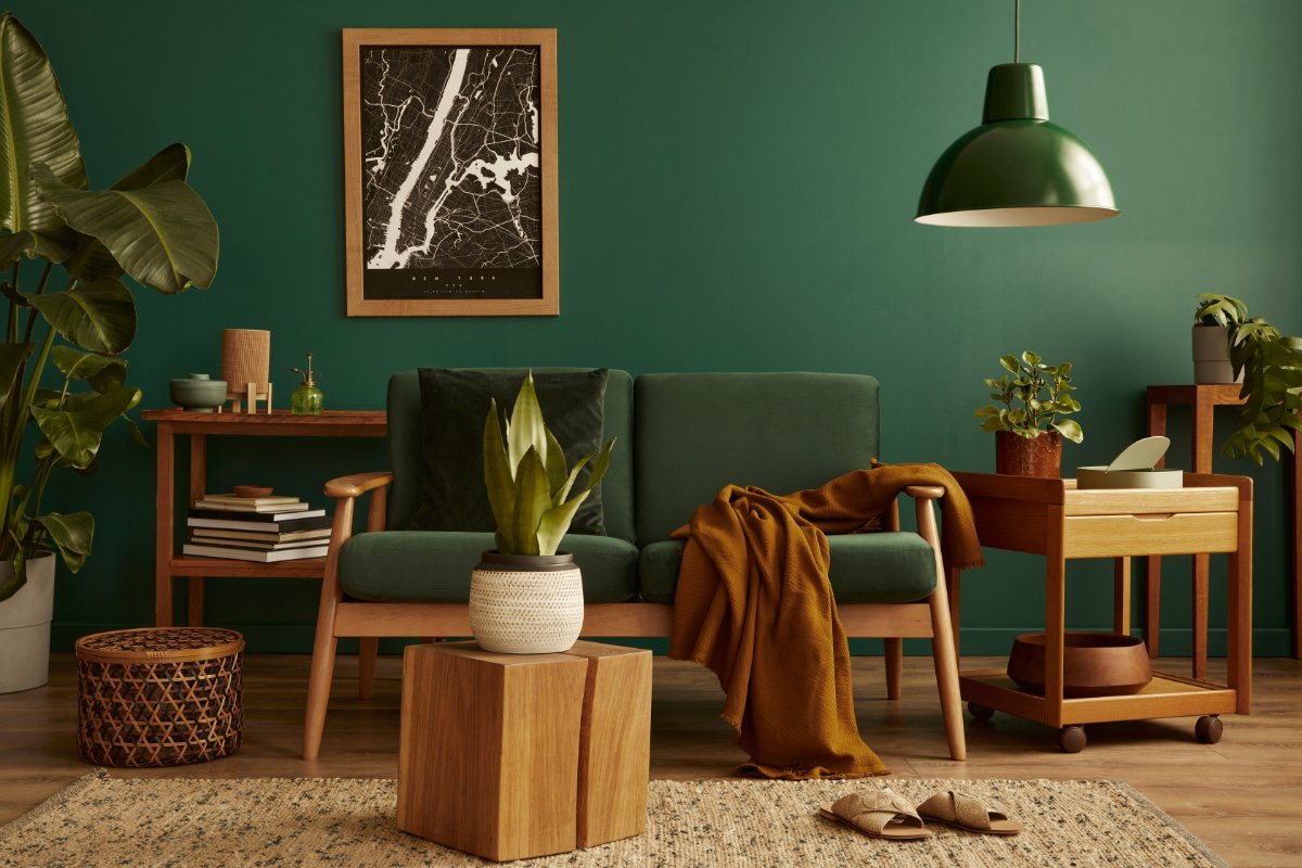
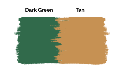
Tan is another soft and soothing neutral color that looks just perfect along with green. Since both are colors of the land, they go along pretty well and design a lovely Tuscan scheme, making it the right tap for cozy bedrooms and living rooms.
The key here is to match the undertones of both colors for a sober, well-tuned look with a soft contrast. So, it’s advisable to go with rustic, reddish shades of green like Army green, hunter green, or emerald green.
Nevertheless, tan is a flexible color. A light tan shade looks modern and eccentric with army green, whereas a darker tan looks traditional but homey. Additionally, ensure that your space has a lot of secondary wood tones or a light wood flooring to tie the elements together and add a lot of accent lighting to add some dramatic visuals.
Best Tan shades from the color wheel that work well with Green:
- ‘Crewel Tan’ by Sherwin Williams
- ‘Lariat Tan’ and ‘Nice Tan’ by Valspar
14. Purple & Light Green


Purple is a charismatic but informal accent color that adds a dramatic pop against a light green. Since light green and purple are cool colors, they look serene and rich together, especially in prominent places like halls, living rooms, and dining areas.
Here, you can either limit both colors as an accent to a neutral primary color or use them as the main color for really dynamic and flashy spaces. Alternatively, if you already have a purple or violet couch, you can add lime green or mint green throw pillows, rugs, or blankets for a contemporary pop-culture-like twist to your everyday spaces.
Purple and light green can be too loud and overpowering if used excessively. Hence, limit them to family spaces and get-together spaces instead of bedrooms.
Here are the best shades of purple color to go with a light green:
- ‘Fully Purple’ and ‘Dewberry’ from Sherwin Williams
- ‘Dark Purple’ by Benjamin Moore
15. Teal & Sage-Green
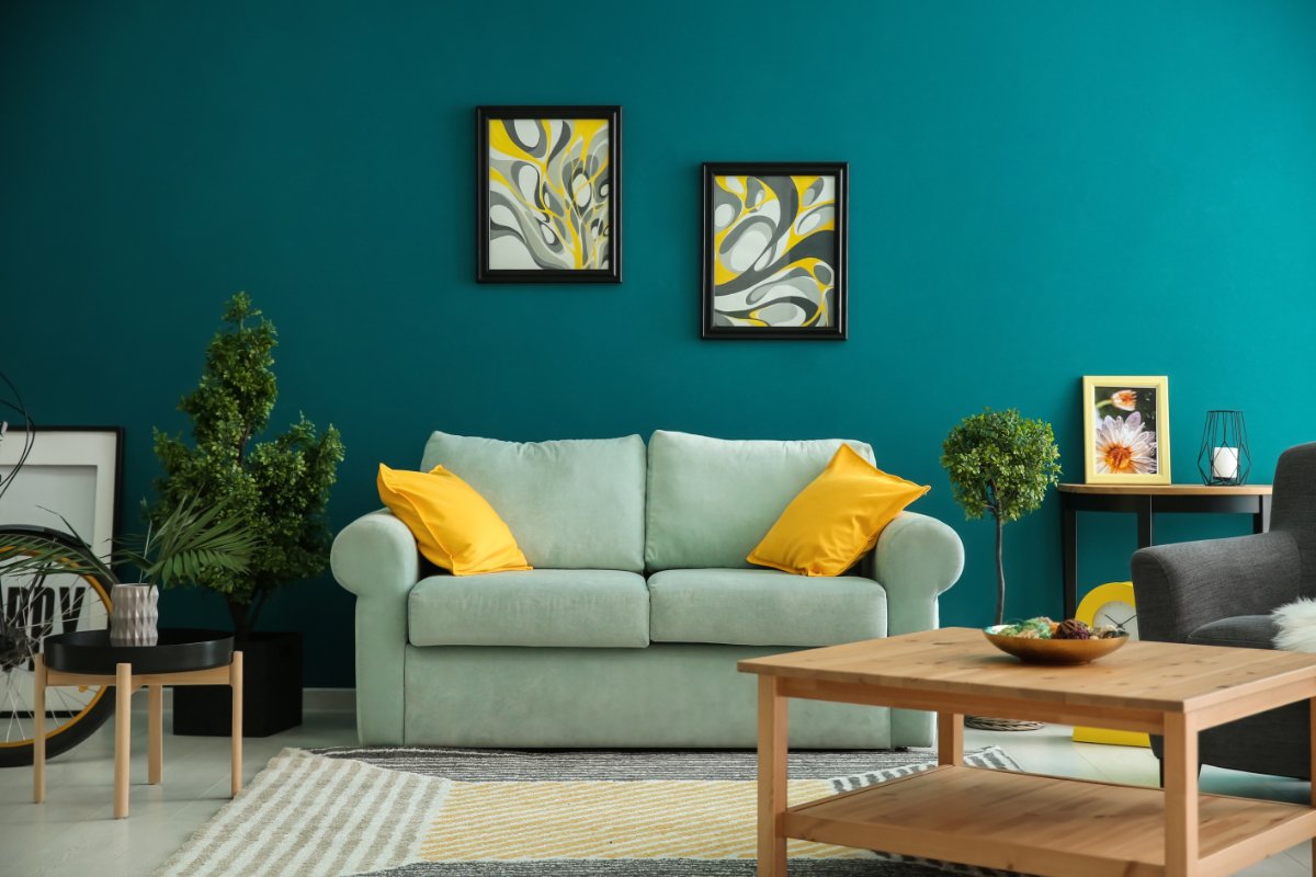
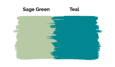
Teal is a fresh and stimulating color to use in home decor, especially with a salient, muted shade such as sage green. It adds a lively accent and a pop of color, creating a balanced look that works well with many interior design styles.
For example, a light teal or alternative turquoise oozes a modern, industrial ambiance when paired with a grayish-sage green like BM Misted Green or Silver Sage. But, a darker teal creates lovely nautical vibes with sage green and works like magic for coastal, creek-side, or mountain cabin houses.
Alternatively, you can introduce teal rugs or throw pillows for a trendy, Bohemian look with sage green walls and complement it with light gray floors or carpets. Overall, teal is a peppy, funky color for unique home decor and looks playful in living rooms, kitchens, bedrooms, lobbies, offices, and even kid’s rooms.
Check out the best shades of teal to contrast sage green:
- ‘Avalon Teal’ and ‘Slate Teal’ by Benjamin Moore
- ‘Vardo’ by Farrow and Ball
Stylish Colors That Go With Deep Forest Green
16. Red & Deep Forest Green

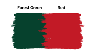
Red and dark forest green are bold combinations for any space. They not only ooze class and luxury throughout your room but also add more visual depth and lively Christmas vibes that suit guest spaces!
Red and green are complementary colors, and a combination of deep red with dark green, such as forest green or hunter green, is nothing short of a high-end ambiance with a transitional design. This color palette does look dominant and formal, but you can tone it down and add a lovely art-deco appeal with subtle gold accents.
Alternatively, you can use muted shades of red like Crimson, Ruby red, or Cranberry red for a toned-down, friendlier Georgian look, or go with brighter cherry reds if you need a striking pop of color.
A bright cherry red could be too harsh on the eyes if used as the primary foundation color in a room. Hence, better to use dark green as the wall color and limit the use of red as an accent color.
Here are the best shades of red to go with dark green:
- ‘Real Red’ and ‘Positive Red’ from Sherwin Williams
- ‘Currant Red’ by Benjamin Moore
17. Dusty Pink (Blush) & Deep Forest Green
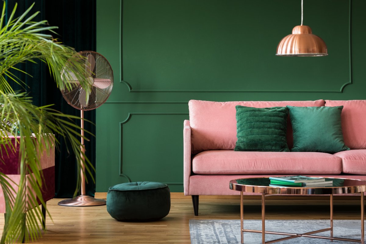
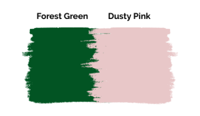
Blush or Dusty pink is a soft, graceful color that adds a youthful look to forest green and offers a contrast of dark and faint tones. Being high contrast and lavish, the duo is the right tap for private spaces like bedrooms, bathrooms, walk-in wardrobes, and reading spaces.
Additionally, the color combination is a boon for experimental houses and can effortlessly switch from traditional or transitional to modern interiors based on the choice of the other secondary colors.
For example, the color combo curates a lovely transitional look when paired with dark accent colors like navy and dark red with slight speckles of gold. On the other hand, you can complement it with light food floors, checkered rugs, and Ottomans for an airy Scandinavian or contemporary color scheme.
Most popular shades of Dusty Pink to go with Forest Green:
- ‘Youth Blush’ and ‘April Blush’ by Behr
- ‘Blushing’ by Sherwin Williams
- ‘Baby Blush,’ ‘Apricot Blush,’ and ‘Adobe Blush’ by Valspar
18. Peach & Deep Forest Green


Peach is yet another charismatic and playful color to use with forest green. Its slightly warm undertones add a soft feminine charm that makes forest green look more casual. It’s a perfect pair for relaxing spaces like bedrooms, bathrooms, and walk-in wardrobes.
Peach goes well with many shades of green but looks the best with a deep forest green backdrop with subtle white and black accents. This color combination designs a lovely eccentric space with a regal and contemporary look.
Peach is a bright color and can look overwhelming if used too much. Hence, always limit it as an accent color and add a neutral, secondary color for balance.
Stylish shades of Peach to go with Forest Green:
- ‘Peachy’ and ‘Peach Butter’ by Valspar
- ‘Creamy Peach,’ ‘First Peach,’ and ‘Peach Mimosa’ by Behr Paints
19. Olive Green & Deep Forest Green

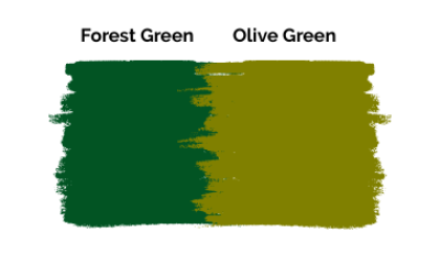
A monochrome color combination of deep forest green and olive green will give your space a modern-retro look and sync perfectly with posh areas. The two shades subtly contrast each other and add a chic appeal, resulting in a soft eclectic style.
If you have olive green walls or rugs, you can add a lovely forest green sofa for a sober European feel. If you have dark forest green or emerald green walls, you can add an organic olive green or army green couch and complement it with similar color curtains that offer a cohesive look. You can check more curtain ideas for a green couch here.
Another perk of using this color combination is that it will look balanced and allow any other color or golden accessories to stand out. Thus, you can add golden furniture legs, stools, or vases and curate crisp, industrial interiors that catch the eye.
Rich, deep shades of olive green for a chic look with forest green:
- ‘Green Suede’ and ‘Siamese Green’ by Behr
- ‘Calke Green’ by Farrow and Ball
20. Dark Gray & Deep Forest Green
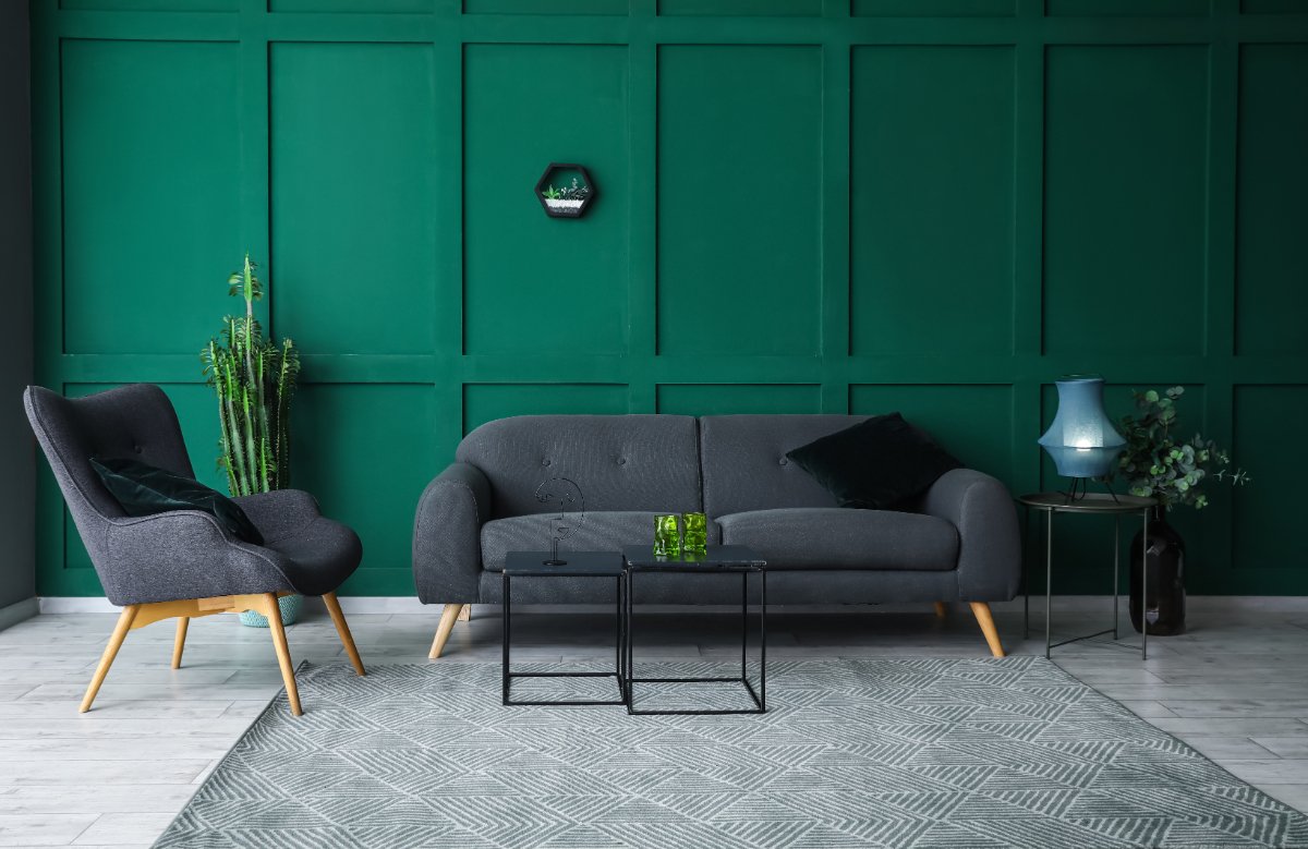
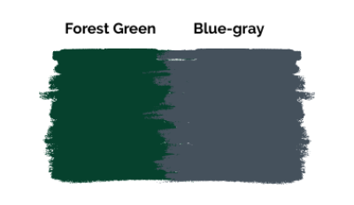
A sleek, metallic dark gray paint gives off a cag, tranquil, and seamless look with green and is the best bet for ultra-modern homes. When paired with darker greens such as Benjamin Moore’s ‘Black Forest Green,’ it results in a contrasting yet balanced look!
Charcoal gray offers a regal, bold personality against the calmer forest green and adds more dimension and visual depth that layers the look. Furthermore, it tones down the vibrancy of deep forest green and balances it with an upbeat Hollywood Regency look. And since it is a shiny, bright color, it is ideal for spaces like kitchens, bathrooms, and even offices.
Here are the best shades of blue-gray to match forest green:
- ‘Waterloo’ and ‘Smoky Blue’ by Sherwin Williams
- ‘Flannel Gray’ and ‘Steampunk Gray’ by Valspar
- ‘Aqua Gray’ by Behr
21. Golden & Deep Forest Green
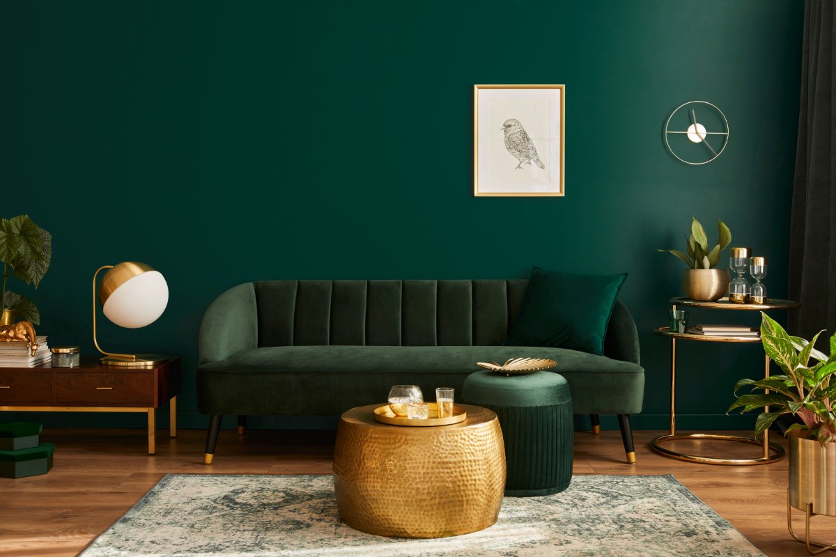
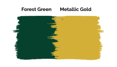
When used with darker greens, golden gives a high-end, luxurious feel. Accent your deep green walls or furniture with metallic gold accessories to add extravagance in get-together spaces like living rooms, lobbies, and entry foyers.
Generally, the color combination of a deep forest green shade and golden looks traditional and Baroque, but you can tone it down by adding a secondary color such as taupe, gray, or cream. If you want a jewel-toned look, add glamorous golden wallpaper to your walls and complement it with deep forest green rugs or couches.
Overall, golden and green is a lavish color combo that adds a mansion-like, dominant look to any space. The color palette is very balanced and completes its look with extremely minimal accessories.
Best shades of golden to match with green:
- ‘Golden Delicious’ and ‘Golden Garden’ by Benjamin Moore
- ‘Golden Chime’ and ‘Golden Retriever’ by Valspar
Tips For Decorating With Green
- A deep, dark green or hunter green generally looks more lavish, regal, but traditional. Hence, matching similar golden or bronze accents is advisable to spruce up the color palette.
- Lighter greens or lime greens are funky, modern colors. Hence, use sleek, stainless steel accents to accentuate their minimal look.
- Try to use sleek, streamlined furniture wherever possible for a bright, clutter-free look with green.
- You can tone down the saturation of your dark green walls by adding a soft texture or by adding more white, beige, or tan accessories.
- Consider the size of your room when choosing the right match with green, i.e., if you have a luxurious room, prefer a duo of green and gray to anchor the space.
- Avoid using the same shade of green for various elements in your home decor, and use lighter and darker shades for more visual depth.
What Colors Go With A Rustic Army Green?
Army green is a soft countryside color and the top-notch choice for farmhouse interiors. The earthy and rustic tones of Army green go well with different colors like beige, tan, brown, copper, and orange and curate a lovely Tuscan ambiance.
What Colors Go With A Light Mint Color Green?
Mint green is a light and soothing color that adapts seamlessly to any design. So, if you want a modern, industrial interior, pick shades of mellow yellow, dusty pink, beige, and copper with mint. But if you want a deep, transitional interior, go for shades like blue, brown, and purple.
Using green decor is a bold move in interior design, but it surprisingly pair well with so many colors that it’s quite interesting to design a room with! From soft, neutral colors to bold and bright colors this guide will help you pick the best partner for the your green decor!
Additionally, green does not always have to be the primary color in a space. You can also use it as an accent in neutral decor, such as gray. If you need more ideas about the best colors to pair with gray, I have a detailed list for you!

